December 30, 2017
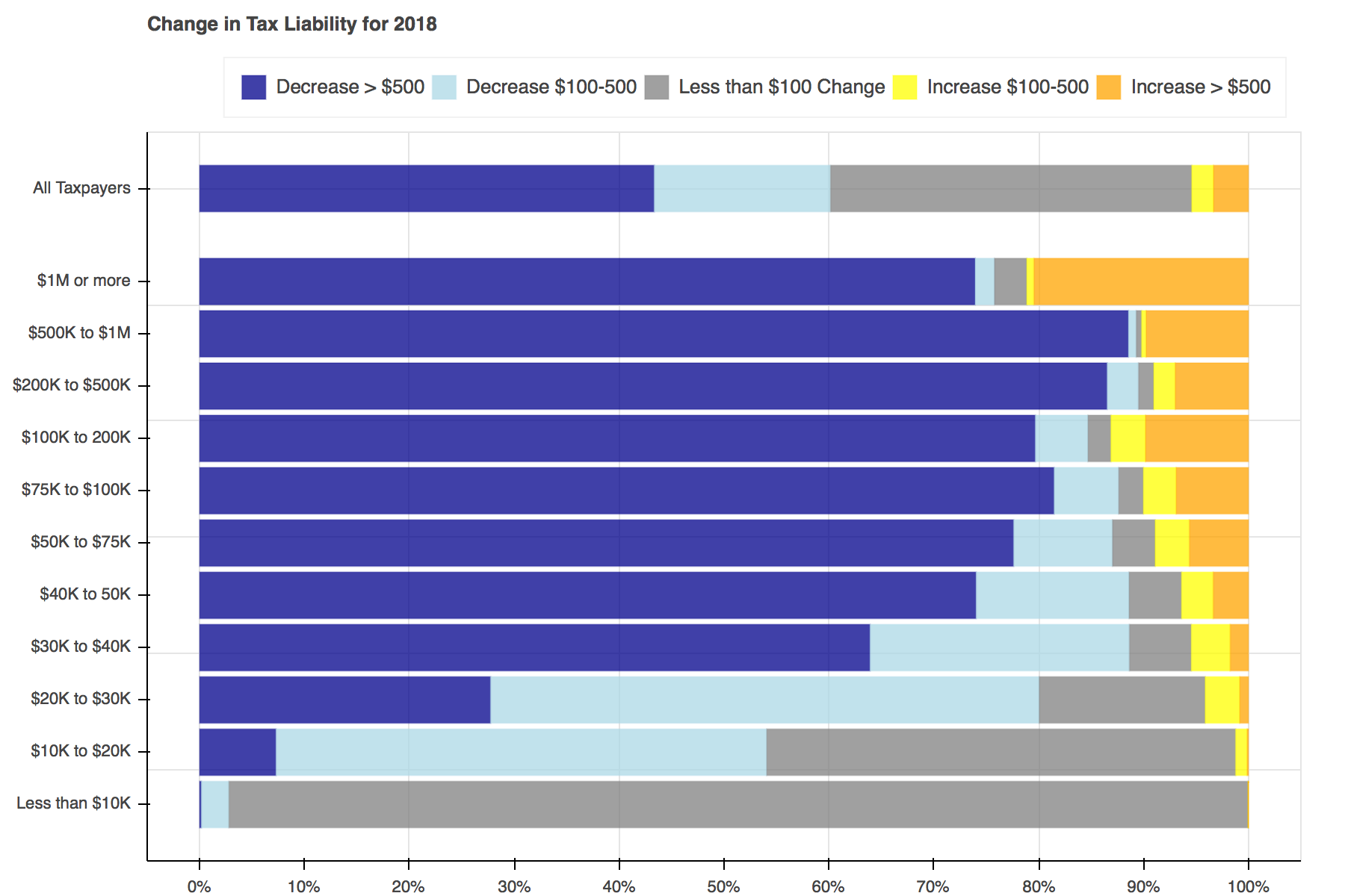
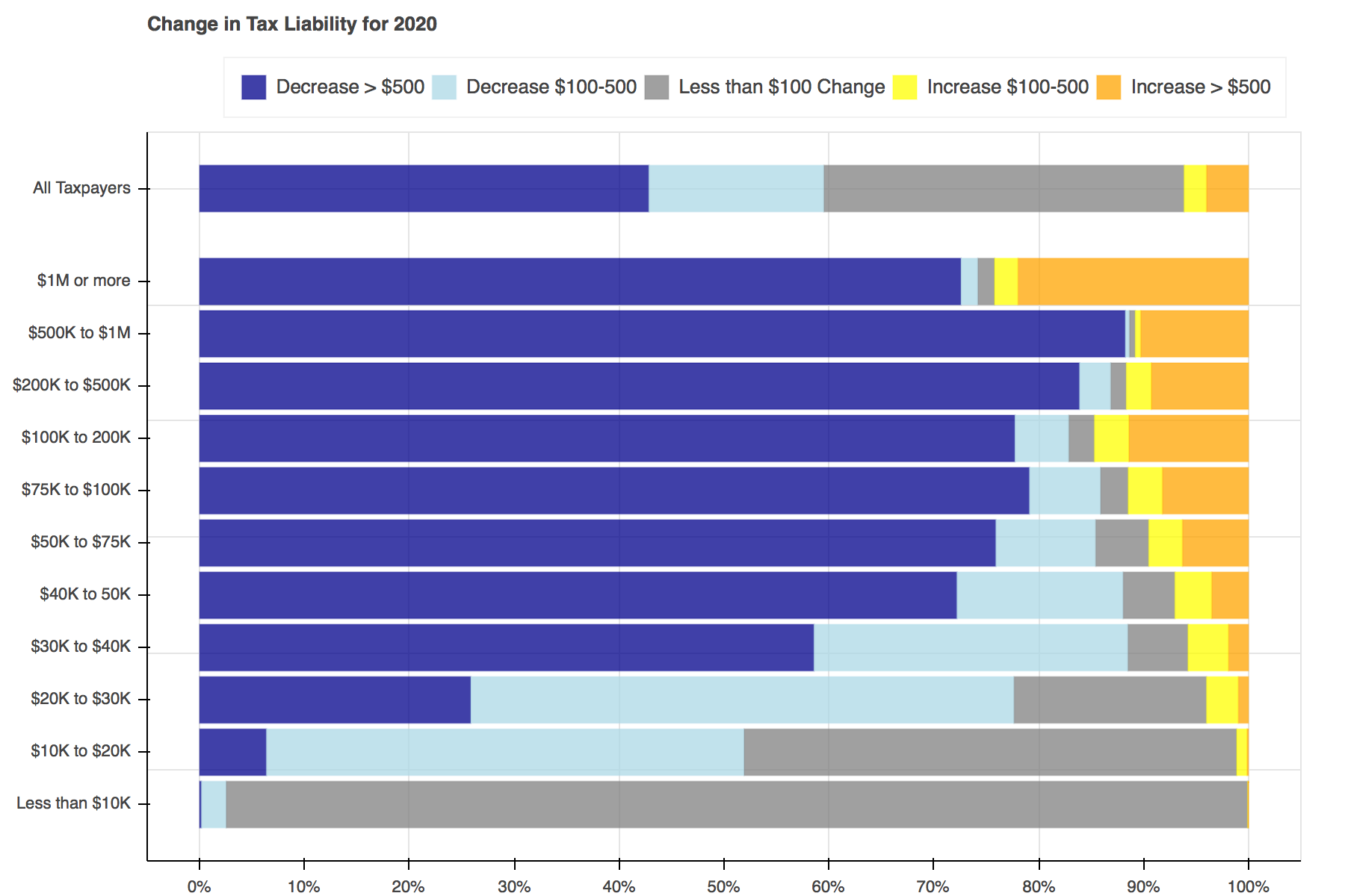
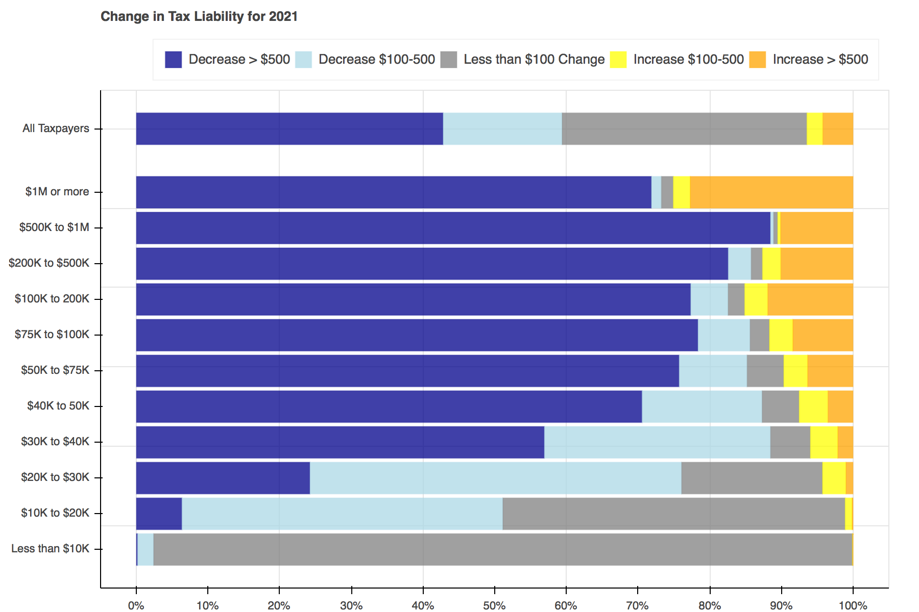
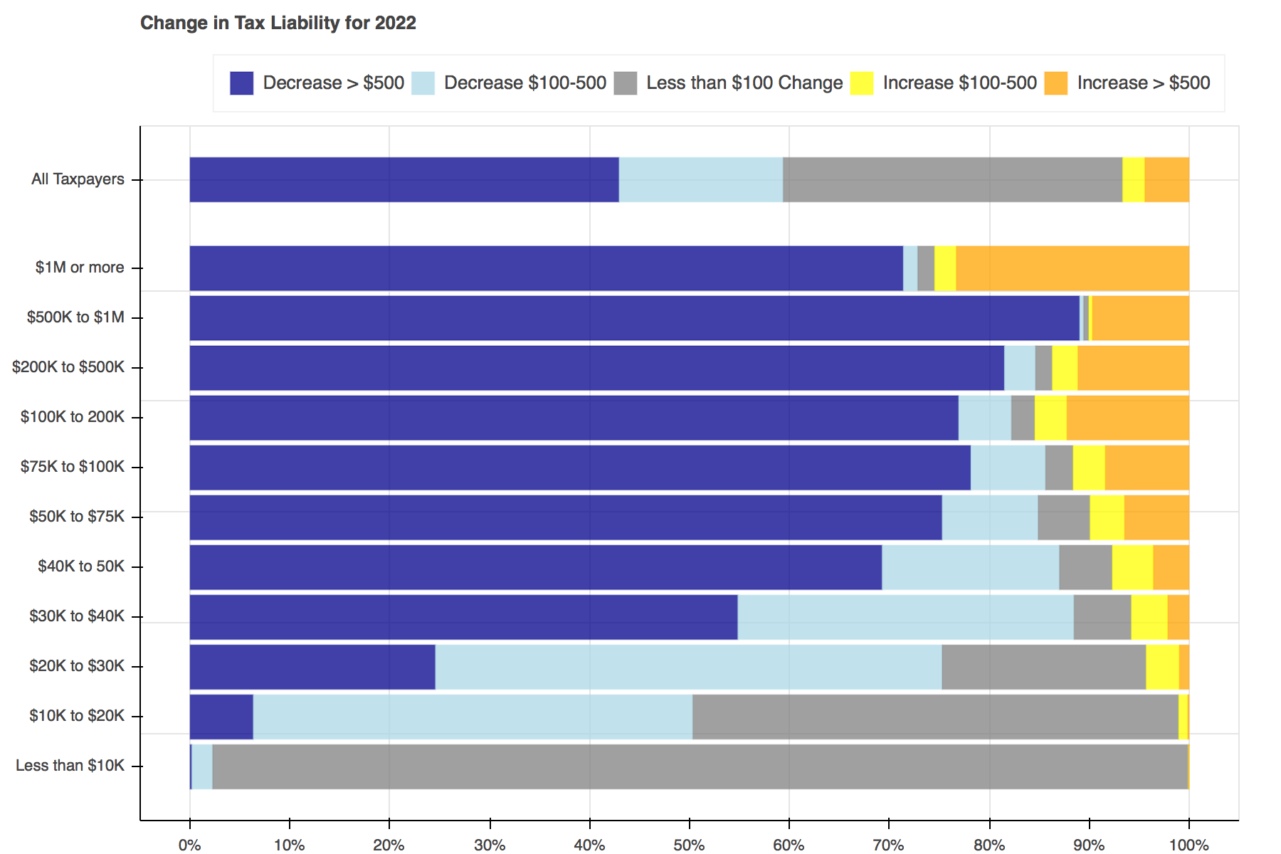
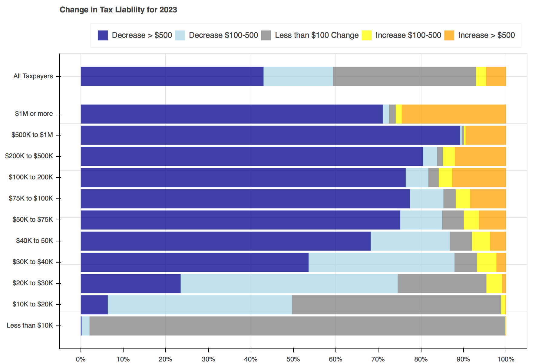
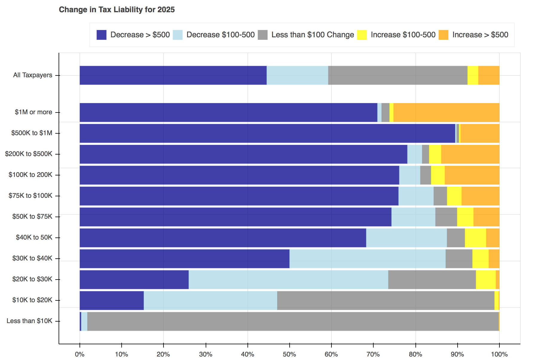
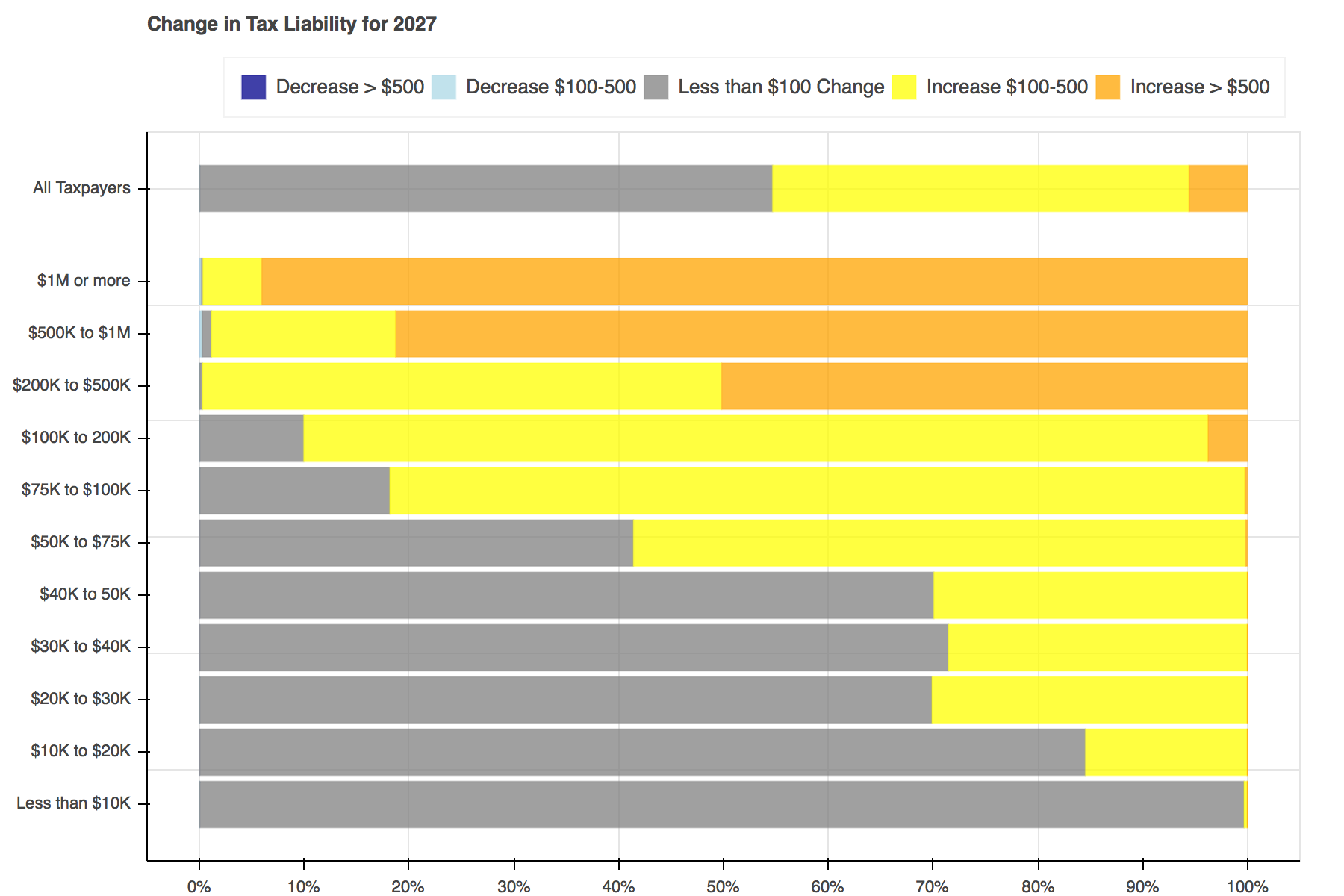
Throughout tax reform season a seemingly endless stream of tables, plots, and charts filled Twitter to show the distributional effects of the Tax Cuts and Jobs Act. I particularly liked Jonathan Schwabish’s piece on how he created a graph to make a report by the Joint Committee on Taxation (JCT) more engaging. I decided to recreate his work using Bokeh and the open-source Tax-Calculator.
The following work was conducted using Tax-Calculator version 0.14.3 and Bokeh version 0.12.13.
from bokeh.plotting import figure | |
from bokeh.io import show, output_notebook | |
from bokeh.models import ColumnDataSource, Legend, FuncTickFormatter, NumeralTickFormatter | |
from bokeh.layouts import column | |
import taxcalc as tc | |
import pandas as pd | |
import numpy as np | |
import copy | |
output_notebook() |
The first step is to create two calculator objects - one for the baseline (current law), and one for the reform. If you’re working directly with the source code, there is a folder in the Tax-Calculator that contains JSON files representing a number of reform provisions including the TCJA. If you’ve downloaded the taxcalc package via Conda, you can download these files on GitHub.
Tax-Calculator requires a representative dataset of tax-units. As a core maintainer of Tax-Calculator and the supporting TaxData repository, I have access to the IRS Public Use File (PUF), which is what I used here. If you do not have access to the PUF, Tax-Calculator comes with a similar file derived from the Current Population Survey. To use this file, replace rec = tc.Records(data='../Tax-Calculator/puf.csv')
with rec = tc.Records.cps_constructor()
.
rec = tc.Records(data='../Tax-Calculator/puf.csv') | |
pol = tc.Policy() | |
calc_base = tc.Calculator(records=rec, policy=pol) | |
calc_base.advance_to_year(2018) | |
calc_base.calc_all() | |
records = tc.Records(data='../Tax-Calculator/puf.csv') | |
policy = tc.Policy() | |
calc = tc.Calculator(records=records, policy=policy) | |
# read in and implement reform file | |
reform = calc.read_json_param_objects('../Tax-Calculator/taxcalc/reforms/TCJA_Reconciliation.json', | |
assump=None) | |
calc.policy.implement_reform(reform['policy']) |
Two functions will be used to create the plots. The first, find_perc
, is used to find what percent of tax filers face each change in tax liability and then the left and right edges for each section within the bars.
The second, plot
, contains all of the logic needed to create a plot for each year.
def find_perc(data, bin_name): | |
# find percentatge for each type of effect | |
sum_wt = data.s006.sum() | |
# tax liability decrease of > $500 | |
large_cut = tc.zsum(data.s006[data['change'] < -500]) / float(sum_wt) | |
# tax liability decrease of $100-500 | |
small_cut = tc.zsum(data.s006[(data['change'] >= -500) & (data['change'] <= -100)]) / float(sum_wt) | |
# tax liability change of less than $100 | |
no_change = tc.zsum(data.s006[(data['change'] > -100) & (data['change'] < 100)]) / float(sum_wt) | |
# tax liability increase of $100-500 | |
small_increase = tc.zsum(data.s006[(data['change'] >= 100) & (data['change'] <= 500)]) / float(sum_wt) | |
# tax liability increase of > $500 | |
large_increase = tc.zsum(data.s006[(data['change'] > 500)]) / float(sum_wt) | |
# find edges for the bar chart | |
bottom = 0.0 | |
total_perc = bottom | |
edge_name_list = [bottom, large_cut, small_cut, no_change, small_increase, large_increase] | |
edges_list = [] | |
for item in edge_name_list: | |
total_perc += item | |
edges_list.append(total_perc) | |
plot_data = pd.DataFrame({'bottom': [edges_list[0]], | |
'large_cut': [edges_list[1]], | |
'small_cut': [edges_list[2]], | |
'no_change': [edges_list[3]], | |
'small_inc': [edges_list[4]], | |
'large_inc': [edges_list[5]], | |
'name': [bin_name]}) | |
return ColumnDataSource(plot_data) |
Creating the plots was simple enough. First a Bokeh figure is created, then it is populated with stacked bars for each income group. Each of the bars is made up of five hbar glyphs stacked together.
When working with hbar glyphs, you need to specify the y location; height (thickness); and left and right edges of each bar. My y-axis placement decisions were arbitrary. As in Schwabish's piece, I wanted the bar for all tax filers to be placed slightly higher than the others, but that's all I took into consideration. You could change the location and spacing to be whatever tickles your fancy.
For formatting, I used the Bokeh's visual styling capabilities. The FuncTickFormatter
allows you to use Javascript or a Python function to format the y-axis labels. I'm not comfortable working with Javascript right now so I defined a Python function - ticker
- that returned the label I wanted based on the y value of each bar. There may be a more elegant way to achieve the same results, but this was a quick and easy solution. It should be noted that if you want to format the axes with a Python function, you will also need to install Flexx
(conda install -c bokeh flexx
).
def plot(cds_list, year): | |
def ticker(): | |
""" | |
function used to create the y-axis labels in the plot | |
""" | |
if tick == 25: | |
return 'All Taxpayers' | |
elif tick == 21: | |
return '$1M or more' | |
elif tick == 18.75: | |
return '$500K to $1M' | |
elif tick == 16.5: | |
return '$200K to $500K' | |
elif tick == 14.25: | |
return '$100K to 200K' | |
elif tick == 12: | |
return '$75K to $100K' | |
elif tick == 9.75: | |
return '$50K to $75K' | |
elif tick == 7.5: | |
return '$40K to 50K' | |
elif tick == 5.25: | |
return '$30K to $40K' | |
elif tick == 3: | |
return '$20K to $30K' | |
elif tick == 0.75: | |
return '$10K to $20K' | |
elif tick == -1.5: | |
return 'Less than $10K' | |
f = figure(title='Change in Tax Liability for {}'.format(year), width=900) | |
# add the row for all tax units separetly to make spacing easier | |
h0 = f.hbar(y=25, height=2, left='bottom', right='large_cut', color='darkblue', fill_alpha=0.75, | |
line_alpha=0.25, source=cds_list[0]) | |
h1 = f.hbar(y=25, height=2, left='large_cut', right='small_cut', color='lightblue', fill_alpha=0.75, | |
line_alpha=0.25, source=cds_list[0]) | |
h2 = f.hbar(y=25, height=2, left='small_cut', right='no_change', color='grey', fill_alpha=0.75, | |
line_alpha=0.25, source=cds_list[0]) | |
h3 = f.hbar(y=25, height=2, left='no_change', right='small_inc', color='yellow', fill_alpha=0.75, | |
line_alpha=0.25, source=cds_list[0]) | |
h4 = f.hbar(y=25, height=2, left='small_inc', right='large_inc', color='orange', fill_alpha=0.75, | |
line_alpha=0.25, source=cds_list[0]) | |
y_val = 21 | |
# add each income group to the plot | |
for item in cds_list[1:]: | |
f.hbar(y=y_val, height=2, left='bottom', right='large_cut', color='darkblue', | |
fill_alpha=0.75, line_alpha=0.25, source=item) | |
f.hbar(y=y_val, height=2, left='large_cut', right='small_cut', color='lightblue', | |
fill_alpha=0.75, line_alpha=0.25, source=item) | |
f.hbar(y=y_val, height=2, left='small_cut', right='no_change', color='grey', | |
fill_alpha=0.75, line_alpha=0.25, source=item) | |
f.hbar(y=y_val, height=2, left='no_change', right='small_inc', color='yellow', | |
fill_alpha=0.75, line_alpha=0.25, source=item) | |
f.hbar(y=y_val, height=2, left='small_inc', right='large_inc', color='orange', | |
fill_alpha=0.75, line_alpha=0.25, source=item) | |
y_val -= 2.25 | |
# general plot formatting | |
legend = Legend(items=[('Decrease > $500', [h0]), | |
('Decrease $100-500', [h1]), | |
('Less than $100 Change', [h2]), | |
('Increase $100-500', [h3]), | |
('Increase > $500', [h4])], | |
orientation='horizontal') | |
f.add_layout(legend, 'above') | |
f.yaxis.formatter = FuncTickFormatter.from_py_func(ticker) | |
f.yaxis.ticker = [-1.5, 0.75, 3, 5.25, 7.5, 9.75, 12, 14.25, 16.5, 18.75, 21, 25, 30] | |
f.xaxis.ticker = [0.0, 0.1, 0.2, 0.3, 0.4, 0.5, 0.6, 0.7, 0.8, 0.9, 1.0] | |
f.xaxis[0].formatter = NumeralTickFormatter(format='0.%') | |
f.xgrid.minor_grid_line_alpha = 0.1 | |
return f |
Once the functions have been defined, all that is left to do is loop through each of the years, advancing both calculators a year at a time, and pass the data needed into the plotting functions.
# list to hold plot objects | |
plot_list = [] | |
# loop through each year, creating a plot | |
for year in range(2018, 2028): | |
# advance calculators a year | |
calc.advance_to_year(year) | |
calc.calc_all() | |
calc_base.advance_to_year(year) | |
calc_base.calc_all() | |
# pull the data needed for the graph | |
base_data = calc_base.dataframe(['s006', 'c00100', 'combined']) | |
ref_data = calc.dataframe(['s006', 'c00100', 'combined']) | |
raw_data = pd.DataFrame({'s006': base_data['s006'], | |
'c00100': base_data['c00100'], | |
'change': (ref_data['combined'] - base_data['combined'])}) | |
# find the percentages falling in each category for each income group | |
cds_all = find_perc(raw_data, 'All Taxpayers') | |
cds1 = find_perc(raw_data[raw_data.c00100 < 10000], 'Less than $10K') | |
cds2 = find_perc(raw_data[(raw_data.c00100 >= 10000) & (raw_data.c00100 < 20000)], '$10K to $20K') | |
cds3 = find_perc(raw_data[(raw_data.c00100 >= 20000) & (raw_data.c00100 < 30000)], '$20K to $30K') | |
cds4 = find_perc(raw_data[(raw_data.c00100 >= 30000) & (raw_data.c00100 < 40000)], '$30K to $40K') | |
cds5 = find_perc(raw_data[(raw_data.c00100 >= 40000) & (raw_data.c00100 < 50000)], '$40K to $50K') | |
cds6 = find_perc(raw_data[(raw_data.c00100 >= 50000) & (raw_data.c00100 < 75000)], '$50K to $75K') | |
cds7 = find_perc(raw_data[(raw_data.c00100 >= 75000) & (raw_data.c00100 < 100000)], '$75K to $100K') | |
cds8 = find_perc(raw_data[(raw_data.c00100 >= 100000) & (raw_data.c00100 < 200000)], '$100K to $200K') | |
cds9 = find_perc(raw_data[(raw_data.c00100 >= 200000) & (raw_data.c00100 < 500000)], '$200K to $500K') | |
cds10 = find_perc(raw_data[(raw_data.c00100 >= 500000) & (raw_data.c00100 < 1000000)], '$500K to $1M') | |
cds11 = find_perc(raw_data[(raw_data.c00100 >= 1000000)], '$1M or More') | |
# create a plot using all of the data collected | |
cds_list = [cds_all, cds11, cds10, cds9, cds8, cds7, cds6, cds5, cds4, cds3, cds2, cds1] | |
new_plot = plot(cds_list, year) | |
plot_list.append(new_plot) | |
show(column(plot_list)) |
Last Updated: December 30, 2017
Tweet